See the Relationships, Not Just the Numbers
Uncountable's Visualizations & Reports turn connected R&D and QC data into correlation plots, live SPC, and dashboards, so structure-process-property relationships are visible in seconds, not stitched together in a spreadsheet.
Deployed by enterprise R&D and innovation teams:



A Screenshot Pasted Into a Slide Is Not Analysis
In most labs, seeing a relationship in the data means exporting to a spreadsheet, wrangling columns, and pasting a chart into a slide that goes stale the moment it is made. Uncountable's visualizations run on live, connected data instead, so a correlation plot, a control chart, or a dashboard reflects the current record and updates as new results come in.
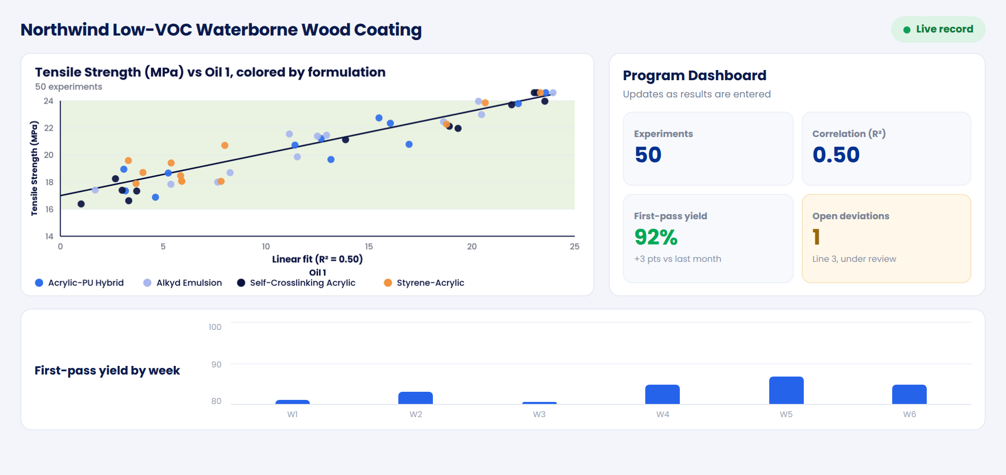
From a Question to a Live Report
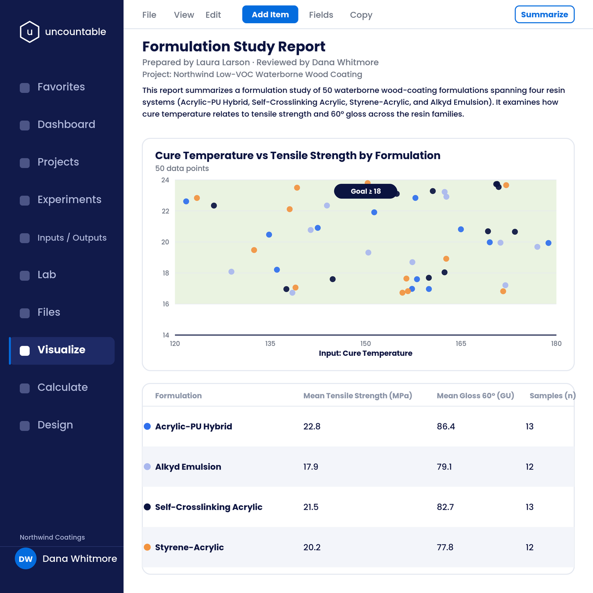
Ask the data a question. Plot and correlate across every experiment to see relationships you would otherwise miss.
See relationships in seconds
Correlate structure, process, and property across every experiment, instead of exporting to Excel and pasting a static chart.
Drill to the evidence
Every point is backed by the full instrument curve, so you can drop from a correlation straight into the raw data behind it.
Always on the live record
Plots reflect current data and update as new results come in, so what you explore is never stale.
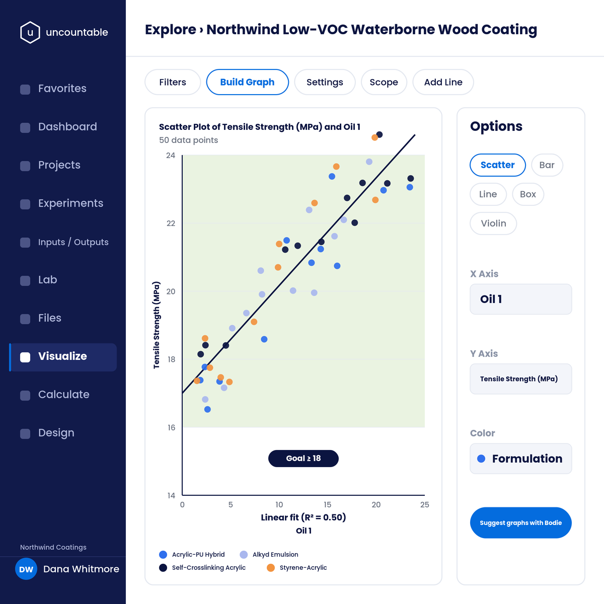
Build any chart without code, and let AI draft it when you want.
Every chart type
Scatter, trend, box, radar, violin, correlation grid, and image compare, colored by any input, output, or condition.
No-code builder
Choose axes, color, and chart type from live data and save to a report or notebook, with axis swaps in a click.
Plots from a prompt
Bodie generates a plot from a plain-language request, figuring out the axes and respecting the current project. Available with the Gen AI module.
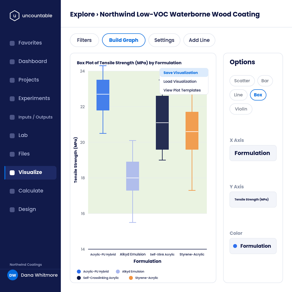
Watch quality live, so drift shows up while you can still act on it.
Live SPC
Control charts update as results are entered, with real-time out-of-spec and control-rule alerts, not a monthly Minitab export.
Capability tracking
Process capability (Cpk) is tracked continuously across product lines.
Quality at a glance
SPC dashboards span lines and sites, so a trend is visible the moment it forms.
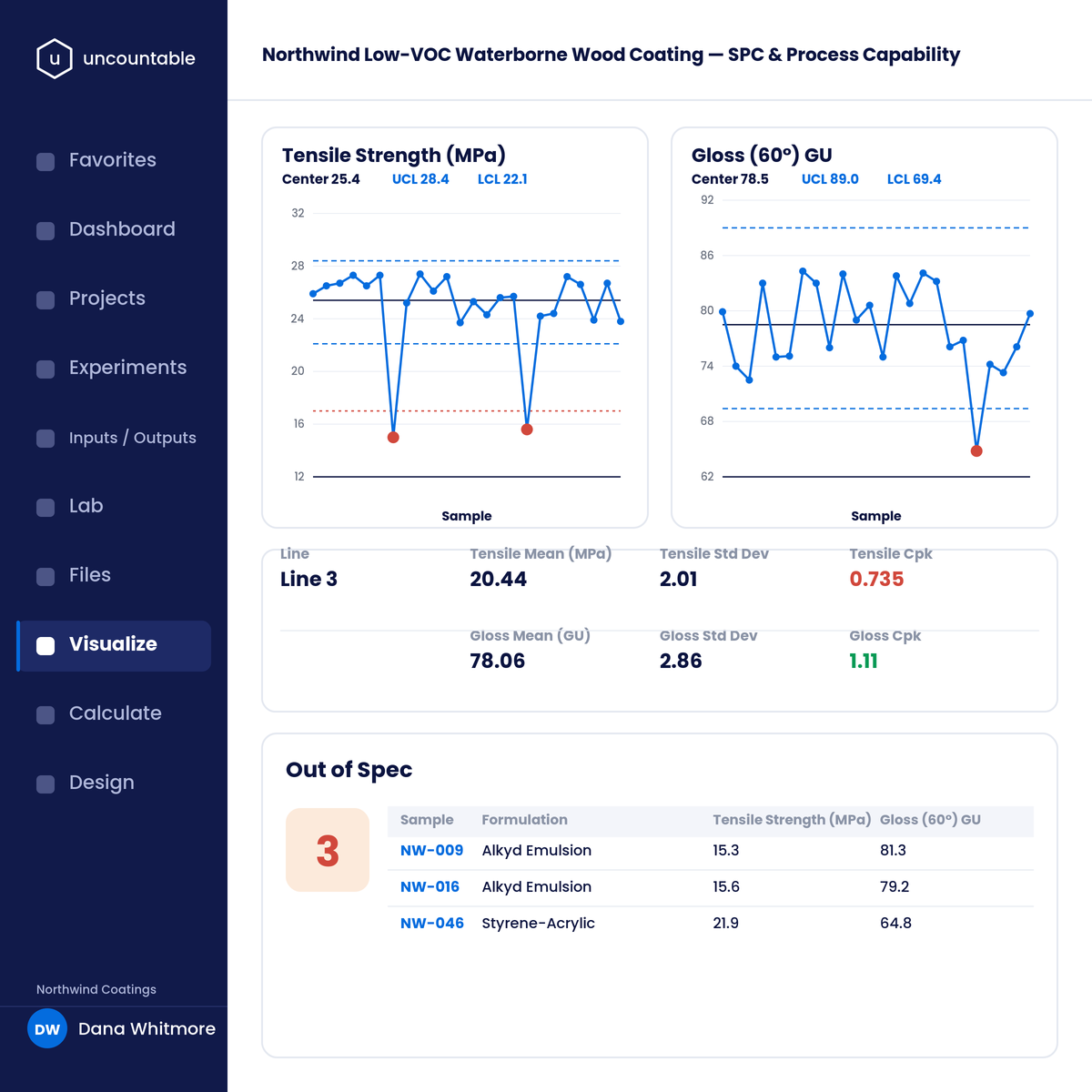
Report on the live record, and draw from every suite, on one platform:
Reports & notebooks
Embedded plots and tables generated from the live record, shareable without a manual rebuild.
Cross-module dashboards
Experiment, QC, and portfolio data in one live view across ELN, LIMS, QC, QMS, PPM, and PLM.
Integrated ELN & LIMS
Plot across every experiment and its full instrument data.
Bodie AI
Generate plots and summaries from a plain-language prompt, with the Gen AI module.
Integrations
400+ lab instruments, bidirectional SAP and ERP, REST API, and SSO.
Guided rollout
Dashboards and reports set up around your decisions during a staged implementation, with your team building more without code.
Before and After Uncountable
Without Uncountable
With Uncountable
What Our Customers Say
Connected lab, pilot, and production data across 105+ users and recovered about 40% of the time previously spent finding experiments and compiling reports.
Analysis that once took hours per day is done in minutes, because the visualizations run on connected data instead of exports.


See the relationships, not just the numbers.
A number tells you what a result was. A plot on connected data tells you what drives it. When visualization runs on the live record, insight takes seconds and reports are never stale. Structure first, AI second.
FAQs
It is the analytics capability of the Uncountable platform, part of the R&D suite: correlation and scatter plots, live SPC control charts, configurable dashboards, and reports with embedded plots, all running on your live, connected R&D and QC data rather than exported spreadsheets.
Those tools work on data you export and rekey, so the chart is a snapshot that is stale the moment the data changes. Uncountable's visualizations run on the live record, so a plot, a control chart, or a dashboard reflects current data and updates automatically, with the full instrument curve preserved behind every point.
Yes. Statistical process control charts update as results are entered, with real-time out-of-spec alerts and process-capability (Cpk) tracking, so quality is monitored live instead of in a monthly export.
Yes. Plot any input, output, or condition against another across every experiment in a project or program, color by formulation or parameter, swap axes, and change chart type, so structure-process-property relationships surface in seconds.
Yes. A no-code builder lets scientists choose axes, color, and chart type from live data and save the result to a report or notebook. Dashboards for projects, quality, and portfolios are assembled from the same connected model.